Small Space Ideas for Doing a Lot with a Little
For most, space within the home is at a premium. As such, homeowners are constantly in search of creative ways to make the most of what they have, especially when what they have isn’t a lot.
Even if you do have more square footage to work with, it’s not always clear how to make the best use of it. This month, let’s talk about small space ideas and design — you’ll see that spatial limitations are no match for the imagination.
Conceptualizing small spaces
When you’re dealing with small spaces, design with functionality first in mind.
Sometimes, that function (or those functions) will be obvious — we know what we need to accomplish in a kitchen or bathroom, for instance. So if they’re undersized, our focus needs to be on flexibility and efficiency — how do we conquer clutter and organize that small space so we can achieve our essential tasks less stressfully?
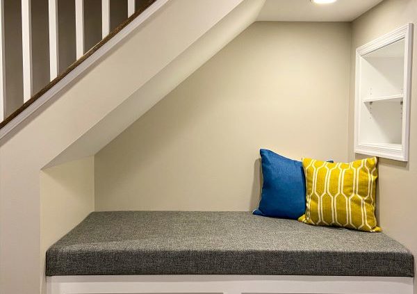
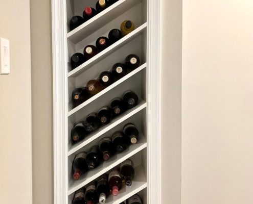
If the small space doesn’t have a pre-assigned role, our first thought should be context. Where is that little awkwardly in-between spot located within the house? Unutilized niche between the kitchen and dining room? Try built-in shelving or storage for wines, spirits, or servingware. That bumpout in the living room for bay windows? Let’s build a bench into that nook to extend seating capacity for guests.
Another way to approach small space design is to play with perception. Here are some ideas to make those small spaces seem bigger. (Without sacrificing their inherent coziness and charm, of course!)
Structure
The physical dimensions of a space are defined by their length, width, and height — floors, walls, and ceilings. So how can we make them seem longer, wider, or taller? The most common solution is probably the build-in — a functional component built into the wall so as to conserve floor space. But you might also give yourself more room to stretch out by removing all or part of a wall, or installing a movable wall — aka a sliding “invisible” or pocket door and nestles into a hollowed-out wall pocket
If you have higher or cathedral ceilings, you might consider incorporating a loft or other mid-level living area to make use of the unused vertical space.
Furniture and storage
We already touched on built-ins as an excellent way to add storage without sacrificing floor space. But supposing you’d like some furniture in your space, that can also be cleverly designed to pull double duty — benches or ottomans with under-cushion storage compartments, compact desks or tables that can be folded up or tucked away with slide-out storage baskets or totes.
Lighting
The interplay of light and shadow has a huge influence on how we perceive a space. We can make tight areas feel more open by distributing multiple light sources along the room’s periphery (e.g. sconces, floor lamps, directed spotlights, recessed/can lights), employing transparent or reflective surfaces (e.g. metal, glass, polished wood), and inviting in as much natural light as we can via a window or skylight .
Color and decor
Light and color also work hand in hand, affecting how we process a space visually. For smaller spaces, our goal is to draw the eyes outward so we are taking everything in as a cohesive whole, rather than in parts. Neutral tones will not call too much attention to themselves, while cooler tones tend to create a sense of distance. Darker or richer paints might serve to accent built-ins and insets, again highlighting elements along the edges rather than in the middle.
Small space design in action
Small bathroom ideas
Primary bathrooms and primary bathroom suites are among the most coveted remodels annually. But if you’re stuck with a tiny hallway bathroom, do not despair. There is plenty of design wisdom we can employ to squeeze functionality out of every square inch.
Sink and vanity
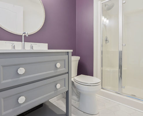
To fit a full bathroom into a small space, any idea will have to account for a sink/vanity, toilet, shower, and/or tub. To this end, we must design our vanities for efficiency. A floating single vanity or wall-mounted faucet leaves space for an open shelf or storage baskets while giving us the whole floor visually.
Pedestal sinks, by virtue of being slender, are also commonly employed in small bathrooms. If you’re still really tight on space, you might consider a corner sink, or at least rounding the vanity. And do not overestimate the impact of mirrors in creating the illusion of space.
Shower/tub
In a hall bath, we’re restricted to a typical shower/tub combo, a standalone shower stall, or a standalone tub — a separate tub and shower aren’t possible, so it’s either pick your favorite or pick the compromise.
For your more standard all-in-one surrounds, shower curtains are tried and true and stay out of the way. If the tub and surround aren’t a single unit, and you have some nice bathroom tiling you’d like to highlight (or to avoid blocking a window), a glass half-wall could make sense. It gives some of the effect of a shower enclosure without the need to install door hardware.
If you are opting for a walk-in shower enclosure, utilize a sliding glass door (versus a hinged), and make your sundries accessible with built-in shower niches.
Cabinets and shelving
A floor-to-ceiling linen closet is probably not a practical idea for your small bathroom, but we can still devise some pretty nifty methods of storing our towels and personal effects. Open shelves are ideal for stacking towels or decor. Also, consider utilizing the vertical space behind the toilet, whether in the form of a ledge or a medicine cabinet.
Small kitchen ideas
We ask a lot from our kitchens. We want ample counter space to prepare our meals, and plenty of cabinets and cupboards to store our gadgets and ingredients. And that’s without considering shiny appliances and seating for residents and guests. A small kitchen might not be equal to all of these tasks, but by working smarter and not harder, we can still accomplish much.
Small kitchen layout
As we discussed in a previous blog about kitchen layouts, the primary goal of kitchen design is optimizing the work triangle — the path between refrigerator, stove, and sink (food storage, preparation, and cleanup). Three layouts tend to predominate small kitchens:
- The galley kitchen: These kitchens are all business — counters, cabinets, and appliances all in parallel, with the home chef in the middle. Usually impractical for dine-in purposes.
- The U-shaped kitchen: Enclosed on three sides with one open end, offers a little more flexibility than a galley kitchen by virtue of the additional of the extra wall.
- The G-shaped kitchen: A modified U-shape kitchen with a partial counter extension (peninsula), allowing for bar-style seating.
Small kitchen storage and shelving
Creative storage and shelving solutions are everything in small kitchens. While we want to maximize the places we have to stow away our cookware, dishware, tools, and ingredients, going wall-to-wall and/or floor-to-ceiling with cabinets can leave us feeling boxed in and dampen the lighting and mood.
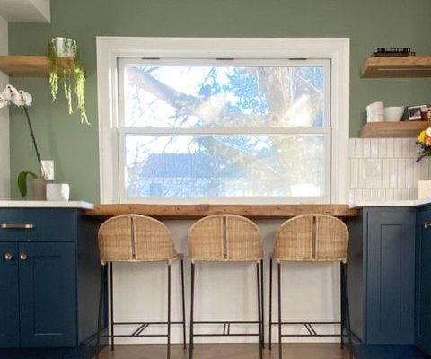
One of our favorite ways to break things up is open shelving. Open shelves expose more wall area, and if we’ve painted our walls a lighter or neutral color, will allow the room to “breathe” more. Stack or arrange your sightlier kitchen items (or decorations) on these platforms, or in a glass display cabinet.
Small kitchen seating
Try as we might, the smallest kitchens probably can’t accommodate a proper kitchen table. But that doesn’t necessarily mean we’re consigned to eating our meals standing over the sink. Not only are breakfast bars charming, they can be constructed so that stools can slide in towards the wall, conserving precious floor space (bench seating paired with a narrow table achieves a similar goal).
As mentioned previously, a peninsula with seating located in the adjoining room maintains that connection with the space without crowding it.
Big ideas for small spaces
Ayars has long prided itself on making the absolute most of our customer’s spaces, no matter how large or small. Our reputation for clever design and careful craftsmanship has culminated in a long waiting list for our services, but we assure you it’s worth it! In the meantime, browse our project galleries for more examples of how we maximize every project.


